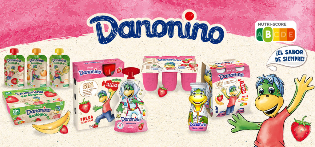
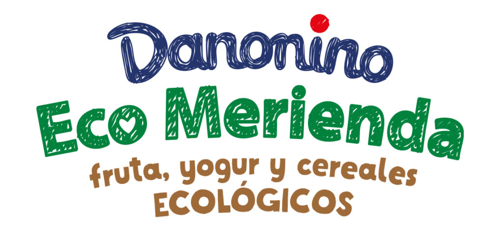
Danonino, a brand for children’s positioning, has taken a brave turn in its image, getting to redesign the brand itself to make it more human, honest and empathetic with its audience: going from a childish typeface with a 3D look to a flat color typeface as drawn by child. His entire image synchronously accompanies this change: he has gone from the more artificial colors of his packs to a more natural and textured look like watercolor that provides much more visual tranquility, honesty and naturalness. In this context, at bartrinadesign we have carried out several projects for the brand, including ECO MERIENDA and Danonino PROFESIONES.
Bartrinadesign